Colours are an intrinsic and fundamental part of our daily existence, yet they remain among our environment's most intricate and multifaceted elements to comprehend and utilize effectively.
Extensive research consistently demonstrates that colours wield significant influence over human psychological states and behavioural patterns, with their impacts manifesting differently depending on various factors, including age groups, gender identities, and diverse cultural backgrounds.
Nevertheless, researchers and educators have identified certain universal principles within the colour theory that, when properly applied, can substantially enhance student engagement levels and maintain focused attention throughout learning environments.
Warm Colours
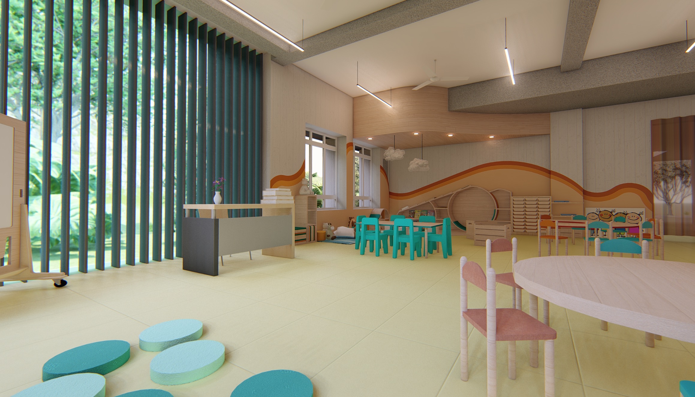
Red, orange, and yellow — collectively known as warm colours — are natural stimulants that enhance energy levels, spark creative thinking, and strengthen motivation. These vibrant hues prove particularly beneficial in spaces designated for collaborative activities, brainstorming sessions, and creative endeavours where dynamic energy is essential.
Multiple studies and observations have consistently shown that young children in their early stages of colour recognition and differentiation naturally gravitate towards the warmer spectrum, particularly reds and oranges, suggesting an innate connection to these energetic hues.
However, these powerful colours demand thoughtful and strategic implementation, as their stimulating properties can potentially become sources of distraction when used extensively. Professional designers recommend incorporating them primarily as carefully placed accents or in mobile furniture rather than applying them across expansive wall surfaces or permanent fixtures.
Cool Colours
Blues, greens, and purples — the cool colour spectrum — function as natural mood stabilizers that encourage mental calmness, enhance concentration capabilities and promote sustained focus. These soothing shades demonstrate optimal effectiveness in quiet study and contemplation environments, such as reading rooms, individual study areas, and examination halls. Their stress-reducing properties make them particularly well-suited for mathematics and science classrooms, where maintaining focused attention and managing academic pressure are crucial for learning success.
Neutral Colours
White, grey, and black comprise the neutral colour palette, offering essential visual balance while creating an understated yet effective backdrop for displaying creative content and educational materials. Lighter neutral tones contribute to spatial perception by making rooms appear more expansive and maintaining cleanliness. Placing darker or more saturated shades on teaching walls can effectively direct student attention forward while reducing visual fatigue and eye strain.
Colour Coding
Colours are powerful non-verbal communication tools, conveying information efficiently and intuitively without relying on written or spoken language.
Identity
Colours are crucial in establishing and reinforcing identity and fostering meaningful connections within educational environments.
This sense of place and belonging can be effectively achieved through strategically implemented colour-coded entranceways, thoughtfully selected colour schemes for different rooms and courtyard spaces, and the creation of distinctive visual environments for students. This systematic approach proves remarkably effective for differentiating between various floors and functional areas within the educational facility.
Carefully designed and positioned colour strips serve as intuitive wayfinding elements, enhancing navigation throughout the space.
Transition / Bifurcation
The strategic placement of colour blocks on walls serves multiple purposes: they effectively demarcate transitions between different functional areas within the learning environment while simultaneously establishing clear movement boundaries for various age groups, enhancing safety and organizational clarity.
Attention / Feature Elements
Wall colours effectively highlight critical safety information and other essential educational content, ensuring important messages remain visible and memorable.
Thoughtfully designed colour blocks can transform otherwise monotonous corridors into engaging feature walls and dynamic breakout spaces that encourage movement and interaction.
Colours represent more than mere decorative elements; they are powerful architectural tools that create visually appealing spaces and environments that actively support and enhance child development across multiple dimensions.
The journey of exploring colour theory and its practical applications across various educational environments presents an intellectually stimulating, creatively fulfilling, and professionally rewarding process that continues to evolve with our understanding of human perception and learning.